Monday, February 28, 2011

Sowing Seeds on North Broad

With the fence down at the new entrance to the Pennsylvania Convention Center and its 13th Street tunnel open to pedestrians, it's becoming more and more tempting to envision a new North Broad. Few people remember this neighborhood prior to the initial construction of the Pennsylvania Convention Center in 1992. Even fewer pictures remain. With the exception of Reading Terminal Market which sat below the rusted Reading Terminal Station next to its derelict head house, few residents strolled the streets just west of Chinatown. Historically this is Philadelphia's red light district, a legacy that continues to this day in its windowless massage parlors.

But is the Renaissance at North Broad and its adjacent blocks already starting to take root? To the naked eye, it's hard to see much more than the Convention Center's newly illuminated facade, particularly when so few are familiar with the surrounding blocks which, with the exception of parking, are all but forgotten by most Center City residents. Despite the fact that developers chose to continue with the center's monotonous Race Street facade which irresponsibly turns its ass to its neighbors, new businesses are already finding their way north of the Convention Center. Considering the transformation the neighborhood underwent following its initial construction in the 1990s, state officials who approved the plans may find themselves regretting the fact that they didn't make the Race Street facade remotely inviting.


Nonetheless, the Sheraton is thriving and a new convenience store is seeing business at 13th and Race. Drexel has dressed up one of its buildings with new windows and an illuminated crown and construction is underway on the Academy of the Arts' Lenfest Plaza. Nearby, construction continues on the infamous graffiti building at 12th and Wood, and even the Watusi Charter School is undergoing improvements. Undoubtedly business franchises are researching locations surrounding the center's North Broad facade which finally gives it a formal entrance. Previously the center felt incomplete, and the retail environment around it reflected its absent presence.

With its main entrance at the unassuming corner of 12th and Arch, it didn't supply as much demand for the larger chains that could benefit from the center's proximity to more than one or two venues. I know many Philadelphians are staunchly opposed to chains, but conventioneers eat them up, and this previously unused neighborhood is the perfect place to contain them. And perhaps if the market can support a number of tourist friendly retail establishments, it can drive the property value up enough to rid this neighborhood of the predatory land hoarders operating the surface lots that litter the surrounding cityscape, or at the very least drive them to build vertically.

Small Development Near the Convention Center

Something's going up on an unassuming corner near the Convention Center. Near Race and Camac, on the corner of Spring and Camac, a warehouse which has been completely gutted for a couple years, has sprouted some hair. I have no idea what it is, who's building it, or what it's going to look like, but it's cool to see something moving, especially in this forgotten little corner of Center City.

Wednesday, February 23, 2011

20 Years Since the Meridian Plaza Fire

For those who have a hard time remembering City Hall without its neighboring Residences at the Ritz, you probably have an even harder time remember it being eclipsed by the towering charred shell of One Meridian Plaza.

Philly.com posted a number of photos from its archive of the fire and its aftermath in honor of the anniversary of the blaze, which happened 20 years ago today.


Philly.com - February 23, 1991 - One Meridian Plaza Fire

See also on PhillyBricks -
One Meridian Plaza


Escher's Waterfall Brought to Life


I spent the better part of a day getting a headache over this. There are a lot of theories online trying to explain how it's done, but he's not coming forth with the truth behind his trick. Obviously an optical illusion, it's nothing short of an amazing feat of carpentry.

Another One Down?

What is up, people? Another one bites the dust? First, Bradley Maule takes our beloved Phillyskyline.com to Oregon, then Philly Brownstoner can't find the $6000 a month they apparently need to log five posts a day, and now Phillyist, our franchise in the the ist chain is "on hiatus"? Is New York the only place people blog anymore?

It's 2011. We need our daily dose of bias ranting from something other than Philly.com.

Lighting Up Market East

Has Mary Tracy, Executive Director of SCRUB (The Society Created to Reduce Urban Blight), ever been to Market East? I often wonder. This is the woman who said of the first serious discussions to improve the decaying corridor in over two decades, "they're talking about taking what could be a really majestic area and totally stigmatizing it with honky-tonk junk."

You would think the last time she walked Market Street from 8th to 12th was 1776 because even since the early 19th Century, Market East has been stigmatized with "honky-tonk junk." It is what it is, and it's how it's succeeded in the past. It's also the street that inspired a nation of Market Streets and Main Streets as the main commercial corridor. What she calls "honky-tonk junk" is what pays a city's bills.

But where is this majestic potential that Mary Tracy envisions? She and SCRUB have only ever played a contrarian thorn, but never offered an alternative solution. Like a lot of Philadelphia's dreamers, I can see a lot in a little. If we couldn't, we'd live in San Francisco or Boston or some boutique city that has already figured out what SCRUB refuses to accept: progress costs money.

But where is the potential in Market East? Is it in the two story Girard Block with its giant McDonald's inspired roof? Is it in the dead Colorforms adorning the vacant Value Plus? No, the potential, while obvious to many may be ironic to SCRUB, is in the blank canvas that is The Gallery.


View Larger Map


Market East's "majestic" 10th and Market, one of a few corners SCRUB routinely ignores in their plight to preserve this stagnant corridor. Why? Because any attention paid to this intersection would prompt the rational opinion: Sure, light it up!
Take a tour.

Illuminated by Hard Rock Cafe's neon guitar and Sole Food's scrolling news feed,
Market East succeeds at 12th. While those who think Philadelphia can't sell anything that doesn't have a Liberty Bell on it refuse to accept that Market East's brightly lit corridor of consumerism will carry our tourists from their hotel to Independence Mall, those with a basic understanding of Economics 101 see the ugly mid-century architectural abortions along Market Street being used to capture billions of tourist dollars along their trek to our historic hot spots.

SCRUB claims to fight for a cleaner Philadelphia, billing themselves as an anti-blight organization, but I can't think of a single instance in which it has done anything to fight urban blight, only stifle capitalism. Have they ever cleared a block of vacant row homes or launched a campaign to clear trash from vacant lots?

Advertisements aren't blight. They pay for things like sidewalks and trees. Ultimately they can even pay to develop light rails and renovate historic city-owned buildings. But the primary focus of this group is to attack corporate investment in our city. Then they assume that taxes will pay for our dreamers' visions, while our taxes barely keep our libraries and pools open.

Unless SCRUB has found the secret wardrobe to a world of unlimited public funds, I think we're better off following the model that saved so many other cities' decaying retail corridor. If Mary Tracy knows something that other cities don't, show me the flute playing goat-man from Narnia and I'll shut up.

She doesn't.
And if SCRUB's interest lied in removing blight, they would be compromising with City Council on a way to attract business - revenue - to Market East.

Instead, they bullheadedly refuse to accept the basic rules of capitalism under the misguided delusion that this city has one and only one thing to offer: "People are coming to our city to visit the historic areas; that's our brand." -Mary Tracy, Executive Director of S.C.R.U.B.

I'm sorry, SCRUB, but I think we're a little better than that. Maybe you can't envision a better Market East, but I sure can. And it's time to turn the lights back on.

Tuesday, February 22, 2011

Bryce Mountain Bricks

I love the unpredictable weather patterns of the mid-Atlantic region. I spent four days in the mountains hoping to ski in 70 degree weather, and once home in Philly I wake up to six inches of snow.

Greetings from Shenandoah County, VA

Main Street, New Market

Thursday, February 17, 2011

One Step Closer to a Glitzy Market East

While the Planning Commission voted against a bill allowing digital and animated signage on Market East, Alan Greenberger, Deputy Mayor for Planning and Development, supports the idea, but just doesn't like the vagueness of the bill.

Market East today, a suffering retail corridor consisting mostly of poor mid-century suburban design and windowless facades. An animated street scape could excite consumers. Historically, Market Street has been shrouded in illuminated consumerism, throughout its Victorian prime and well into the neon-clad 50s and 60s.

Councilmen DiCiccio and Kenny introduced the bill late last year, seeking to illuminate the deteriorating stretch of Market Street and generate revenue through advertising that could be used to improve its infrastructure.

The idea received mixed reviews, mostly positive under the assumption that the few remaining historic facades between 7th and 13th not be touched.


While the Rules Committee is moving forward with the discussion, the existing bill is either expected to be amended or rewritten.

While Market East's potential is only a microcosm of Manhattan's Time Square, New York's illuminated corridor of capitalism once suffered from similar civic neglect. One could even argue that Market East has been allowed to decline even further than Times Square ever did in its seedy past. Even the porn palaces left Market East.

Whatever the outcome with this specific bill, it is exciting to see the Planning Commission eagerly engaged in conversations about a revitalized and illuminated Market East, perhaps Center City's least tapped resource.


Wednesday, February 16, 2011

We Don't Need a New Dilworth

A brisk leisurely stroll through Center City down an eerily quiet West Market Street on a Saturday night past our empty, and often reviled, Dilworth Plaza got me thinking: Is it that bad?

In the summer, Dilworth Plaza offers a sunken oasis from the traffic surrounding City Hall. Its graceful arches and stepped fountains interact with the three dimensionality of the space.

With some federal dollars burning a hole in the city's pocket, critics and architects have swiftly praised a handful of shortsighted designs without closely looking at the resource we already have.

What is wrong with Dilworth Plaza? In a word: Nothing. At least nothing in regard to the design of the space. Which, if we should be replacing it, should be our foremost concern. After all, if the problem with Dilworth Plaza were its element, and not its architecture, shouldn't we be addressing that first?

But Dilworth Plaza is well designed. It compliments its surrounding property in both its form and materials. It's recessed seating area offers a quiet oasis to lunch away from the noisy traffic around City Hall, and offers a three dimensional space that allows for its dramatic fountains and unique views of the skyscrapers bordering the plaza.

Dilworth Plaza's problem lies not just in its element, but in the fact that the city has given up on it. And given the condition of the area after its construction, the plaza was never really given a chance to be much more than an entrance to a transit hub. But that doesn't mean it was a bad design. In fact, it's a great design.

An early rendering of the existing Dilworth Plaza. Renderings are marketing tools, showing us the best of any design, good or bad.

Like Rockefeller Plaza, the sunken garden with its graceful arches could be home to so much more.

Renderings are exciting, and most of all they offer us a clean slate. But look at the new design proposed for Dilworth Plaza, and ignore all the people. It's a one dimensional concrete patio. The design leaves no way for sculptural additions, landscaping, or even people to interact with the space.

It's flat, in every sense of the word.

The proposed reconstruction of Dilworth Plaza. Remove the life from the picture and you have a very flat, concrete plaza, a space stripped of architecture. It offers us a chance to start over, but little else.

It offers us nothing more than a very expensive fresh start, and its success lies in the assumption that people will flock to it simply because it's new. In fact, this new space offers nothing that Dilworth can't currently support, and support in a far superior fashion.

While the proposal's ice skating rink offers the plaza as a destination attraction, it provides no architectural space for the resources needed to maintain an ice skating rink. Where are the rental facilities? Where is the cashier?

No provisions have been made to address the plaza's golden egg. Will we have to construct make-shift kiosks in the winter? Why bother? Dilworth Plaza was designed to grow and accommodate multiple uses.

Rockafeller Center's sunken plaza offers a much more architecturally successful attraction than Dilworth's proposed reconstruction. Dilworth Plaza could easily be outfitted to support a similar project.

Its recessed plaza offers architectural elements that could house these facilities with very few alterations and keep the crowds of skaters contained and organized. The recessed plaza even offers space that could potentially be used for concession stands and warming rooms. Space that will become useless if it's put under the concrete divide of bad planning.

Dilworth Plaza's recessed space is already engineered to house an ice skating rink and any facilities required of such a feature. The proposed "upgrades" would require these facilities to either be inconveniently housed underground, or in make-shift, seasonal kiosks.

Illuminating the plaza and its artwork at night, improving its landscaping, and perhaps more than anything, cleaning the space would do wonders for what many would argue is an architecturally significant space. While encouraging the public to use this space is an ultimate bonus, the proposed reconstruction is nothing but a poorly designed assumption.

Polish the gem that people have forgotten about, turn on the lights, and remind them it's there. You'll see crowds lining up to ice skate no matter what it looks like, but take a closer look at what we've got before it's decided to bury it under a thin layer of mediocrity.

Erdy-McHenry Garage Gets Zoning Approval

Around the corner from a soon to be bustling North Broad Street is a small surface parking lot. Well, actually there are two, but the unused eyesore with the busted fence will probably remain in the hands of the city forever.

But the one cornered by Arch and Juniper, wedged between the historic Masonic Temple and the United Methodist Church has received zoning approval, and will be developed by Raelen Properties of Berwyn, PA...with a handful of neighborly caveats.

Months ago neighbors were stomping their feet at this proposal in a town meeting (I live here and still can't fathom who these neighbors are), but with concessions made to provide the church with an elevator shaft among other promises to the church and the temple, the naysayers seemed to have settled down.

President of Raelen, Dennis Maloomian is also involved in the conversion of the Liberty Title Building, the historic tower across the street solely occupied by Dunkin' Donuts, into a hotel.

While not officially part of the convention center, the to-be hotel is seen as part of the whole by most. Being the lone private project on the three blocks the Convention Center occupies, if left vacant it would undoubtedly give conventioneers a bad first impression, no matter how bright they light up the facade.

Not too many things are creepier than an abandoned skyscraper, and I'm sure the Philadelphia Planning Commission doesn't want to make things too difficult for Maloomian, especially if word got back that their stubbornness was responsible for the white elephant attached to the PCC.

Nonetheless, Maloomian seemed to have made a very valid case, and seems eager to appease neighbors and build the best garage ever. I'm not a fan of parking garages. Not too many urbanites are. But they're better than surface lots, and Maloomian has chosen to employ local architects Erdy-McHenry to design the building.

Responsible for the Radian at Penn and Avenue North at Temple, their quasi-futuristic approach will be a unique juxtaposition to the masonic structures around City Hall. Initial renderings show a setback accordion style, reflective screen. If implemented, it will be interesting to see how it reflects the new lighting scheme on Broad Street down the Arch Street corridor.

West Philadelphia Tour

Because sometimes you just want to look at pictures, here's a small pictorial tour through West Philadelphia. Mostly Spruce Hill, I noted historical information where I could find it. Surprisingly, little information is readily available on some of the neighborhood's grander mansions.

41st and Spruce

A similar neighbor in 1964.


4206-4218 Spruce Street


4206-4218 Spruce Street in 1965.


42nd and Spruce
4200 Spruce Street
Clarence Howard Clark, Jr., Residence
Built c.1868
Designed by Mantle Fielding, Jr.
Alterations by Furness & Hewitt c.1875


Clarence Howard Clark, Jr., Residence c.1901

4201 Spruce Street
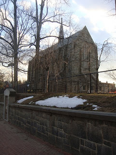
Saint Andrew's Chapel
Designed in 1923 by Zantzinger, Borie & Medary.

4201 Spruce Street was originally the site of the residence of Clarence Howard Clark, father of Clarence Howard Clark, Jr.


42nd and Locust


42nd and Locust in 1964.


4300 Block of Spruce


45th and Spruce

4418-4422 Spruce Street
Concord Hall Apartments
Built c.1923

Concord Hall c.1925


4400 Block of Spruce


4501-4507 Spruce Street


4501 Spruce Street


4537 Spruce Street

Built c.1904
Designed by Mahlon H. Dickinson


4500 Block of Spruce


4600 Spruce Street

Built c.1910
Designed by E. Allen Wilson.


4600 Block of Spruce


46th and Pine


4600 Block of Pine


4431-4439 Walnut Street

Built c.1907
Designed by Clarence Eaton Schermerhorn
Originally the 40th Street Methodist Episcopal Church
Mount Ephraim Tabernacle Baptist Church
As of 1992, serves as the Association of Islamic Charitable Projects Headquarters.


Restaurant School of Philadelphia


The Restaurant School building in 1965.


Renovated offices of Campus Apartments property management.


Monday, February 14, 2011

The Lights are Bright on Broad Street

I was never sure which Broadway that song was about, probably because I never really listened to the words.

But Broadway or Broadway, Philadelphia's Avenue of the Arts is becoming more and more illuminated to reflect the great neon entertainment corridors that inspired our vision.

As I happened to pass the Pennsylvania Convention Center Saturday evening I was lucky enough to catch a nice little surprise. The center was testing the facade's lighting scheme.

With the construction of Lenfest Plaza and the PCC lighting up this once desolate neighborhood so close to City Hall, it will be exciting to see how the area continues to develop.

Thursday, February 10, 2011

LOVE

Just when you thought the holidays were over, one of the most notorious (depending on whether you're single or not) sneaks up and bites you in the ass.

Honoring the martyrdom of Saint Valentine, this weekend will be spent securing last minute reservations at the Olive Garden, scouring the shelves of CVS for the lone remaining Whitman's Sampler, and undoubtedly sending hundreds of bitter, awkward, or simply lazy e-cards.

What's certain is that on Monday, JFK Plaza will be transformed into a sea of red, with huddled lovers posing in the cold in front of Robert Indiana's famed LOVE sculpture.

Indiana's famous sculpture first found itself at the plaza as part of Philadelphia's United States Bicentennial celebration. Although removed two years later, Philadelphia Art Commissioner Euguene Dixon, Jr. was urged by popular demand to return the sculpture as a permanent fixture in what is now commonly referred to as LOVE Park.

Although LOVE Park is probably one of the most widely known locations for the famous sculpture, it wasn't the first and certainly not the only. Robert Indiana's first LOVE was shown on a Christmas card created for New York's Museum of Modern Art in 1964. The first three-dimensional LOVE sculpture was exhibited in New York City in 1970. It was moved to the Indianapolis Museum of Art five years later and has been on display there ever since.

Three years before it was first placed in Philadelphia's JFK Plaza, it appeared on an 8 cent stamp in 1973, perhaps one of the most iconic images ever to be produced by the United States Post Office.

The sculpture has been reproduced in Chinese, Hebrew, Italian, and Spanish. With its presence around the globe, Philadelphia is proudly home to two. Another LOVE sculpture can be found on the University of Pennsylvania's campus.

The image has been the source of parodies, many political. Advocates, both for and against the Obama campaign, used the image substituting the original "LOVE" with the words "HOPE" and "NOPE". Stickers from the campaigns can still be found around the city.

Wednesday, February 9, 2011

The Other Bergdoll Mansion

A Ghost Story

In the fall of 1962, construction began on the first major residential development in West Philadelphia in decades. As part of a campaign to revitalize the declining neighborhood beyond the city's university district, University Mews launched a concept that remains to this day.

But before anyone spoke the moniker "University City", the neighborhoods surrounding West Philadelphia's universities were known by their historically proper names such as Powelton Village and Woodland Terrace. Unfortunately the architectural playground of Philadelphia's Victorian nouveau riche had an expiration date.

Many of the larger palaces built by the Industrial Revolution were left behind with unclaimed inheritances. The Great Depression left even those with means without the excessive resources to maintain the grandeur of the Gilded Age, so many of our city's greatest estates stood for as little as two decades.

Some properties passed through the hands of relatives and colleagues, often boarded up and home to squatters. Others burned or simply collapsed. And one example, befitting the dark humor of Charles Addams, inhabited by mysterious and unknown eccentrics fed neighborly folklore, rumors, and ghost stories.

4500 Spruce Street, the Charles Moseley Swain Mansion, was surrounded by a stone wall which remains today at University Mews.

Deserted by 1958, the Swain Mansion at 45th and Spruce was mistakenly claimed by neighbors as the Bergdoll Mansion, named for Grover Cleveland Bergdoll, a famous World War I draft dodger. The actual Bergdoll Mansion still stands 2201 Green Street and is on the Pennsylvania National Register of Historic Places.

But while there is no evidence that Bergdoll ever owned the house at 4500 Spruce, the rumor is characteristic of a time and place when a struggling neighborhood would spin tales of their colorful past as a proud source of entertainment. There was nothing historically significant about the Swain Mansion, but its soul lived on long after its prime creating an infamy far more notorious than anything that actually happened at 45th and Spruce. Even as a ghost, the Other Bergdoll Mansion was inspiration.

The Fire Insurance floor plans for 4500 Spruce Street

The History of 4500 Spruce Street

The real story behind the rubble that now lies below University Mews isn't so exciting, so unless you're a history nerd, the rest of this article may bore you. I find it interesting because Charles Moseley Swain, the man who originally resided at 45th and Spruce, is my great-great-great-grandfather.

One of two brothers, Charles M. Swain grew up in the affluent North Broad Street section of Philadelphia at 1426 N. Broad, now the site of the YMCA. His father, William Moseley Swain, with Arunah S. Abell and Azariah Simmons, founded the Philadelphia Public Ledger and the Baltimore Sun.

Swain moved into his house at 45th and Spruce in 1876. While the architect is unknown, alterations were designed by his colleague Wilson Eyre in 1892. Eyre also designed the City Trust, Safe Deposit, and Surety Company of Philadelphia building, over which Swain presided.

Charles Moseley Swain died in 1904, leaving the house and a fortune without a will. The house was sold to Thomas M. Thompson in 1913 by Swain's son and daughter. Thompson, a colleague of Swain's, served with him as directors of the Edison Electric Light Company.

Swain's son, Charles James Swain, built a group of Tudor revival townhouses uniquely contrasting the Victorian architecture that dominated the block, across the street from his father's home. 4501-4507 Spruce still stand today.

4501-4507 were built by Charles Moseley Swain's son, Charles James Swain, across the street from his father's home.

The Swain Mansion, obviously and unfortunately, did not share the fate of his son's sustainably scaled townhouses. The property was divided and the carriage house was demolished to build the Pinehurst Apartments. The mansion remained in the Thompson family until it was sold to the Hanna Realty Company in 1954 who prepared it for development, selling it to Universal Properties in the spring of 1962. It was demolished that same fall.

A West Philadelphia Elite

Although the wealthiest pioneers of Philadelphia's Industrial Revolution lived west of the Schuylkill River, Philadelphia's culture warriors snubbed the sprawling Victorian estates of West Philadelphia. Center City's elite thought themselves proper Philadelphians and limited themselves to Rittenhouse Square.

The University of Pennsylvania and its fraternal system segregated itself during West Philadelphia's prime. Students prided themselves on having no family living west of the river. These "proper" Philadelphians even claimed their counterparts had accents unique to the West Philadelphia neighborhoods.

Today, Philadelphia's historic caste system remains, in part. Rittenhouse's most dedicated elite even turn their noses to Society Hill, pegging it a rebranded Colonial theme park. But regardless of its stigma and patchy architectural legacy, West Philadelphia's residents ran Philadelphia during its golden age.

Among many other charges, Charles Moseley Swain was a director of the West Philadelphia Passenger Railway Company, a director of the American Academy of Music, and founded the Charles Moseley Swain Lodge at Philadelphia's Masonic fraternity.