Friday, October 30, 2009

Philadelphia's Thriving Market Street

Until the end of the 20th century, Market East was Philadelphia's bustling center for retail commerce. It wasn't always pretty, but the eclectic collage of ever changing businesses illuminated in neon succeeded as the urban equivalent to the sprawl enjoyed by suburbanites.

Seen here in 1953, 13th and Market was a bustling and dense hub of commercial activity. The NE corner of this intersection is now occupied by the block-wide Marriott hotel while the NW corner is occupied by a surface parking lot.

So what happened? It's easy to blame urban flight, but Market East's real estate stock didn't completely crash until the late 1980's, perhaps even the 1990's. Before that the gritty patchwork of businesses and merchants successfully served commuters and locals alike.

In 1965 Snellenburg's department store spanned the south side of Market Street between 11th and 12th in what is now known as the Girard Block, a two story placeholder that has been holding a place for several decades.

As a wave of "improvements" for the surrounding neighborhoods began, it is almost as if Market East's intended renaissance was exactly what sealed its coffin. While large corporate entities such as Aramark, Marriott, and Loews succeeded in bringing a large number of employees to Market East, many of the street's original merchants who at one time serviced these employees had been removed in anticipation of larger development which never came.

Howard's department store, seen here in 1966, is now the site of Aramark headquarters. The lot in the foreground was made for The Gallery at Market East and is now the site of Burlington Coat Factory.

As Gimbels and Snellenburg's closed, the Gallery's JCPenny and Clover were replaced with Burlington Coat Factory and K-Mart. Closing Strawbridges left many Gallery merchants without residual clienette forcing the closures of stores such as The Gap and Guess.

Seen here in 1966, Gimbels department store was demolished for anticipated development and is now the site of surface parking lot nearly the size of an entire city block. It is controlled by predatory land developer Ron Rubin - who has no intention of developing it further.

Today very little remains of Market Street's namesake. Real estate on Market East is so affordable that space formerly occupied by large variety stores such as Woolworth are now occupied by convenience stores such as CVS or Rite Aid. Many businesses use their upper floors for storage or simply leave it empty.

The upper floors of Robinson's space age department store are now used for storage or simply left empty. Surprisingly this uniquely early design is not historically protected.

Unfortunately the fate of Market East seems to rest in the hands of private developers. While several years ago, many could not have imagined it getting much worse, it now serves as a worn example example of what happens when you try to fix something that isn't broken.

The Gallery at Market East today: It isn't aesthetically - or philosophically - worse than any other mall. But as made evident in recent years, it is hurt by the declining, surrounding real estate.

Although it's certainly not the time to start fielding new businesses to rent questionable or risky real estate, it is the time to start looking at what used to work and what we can do at little cost that make places like Market East a little more desirable and look a little less like Thunderdome. While a very small gesture, Burlington Coat Factory seems to understand this and is in the process of renovating the space and improving its curb appeal with new signage, entrances, and window displays. While it's hard to ignore the gaping holes along Market East, many other businesses would be wise to follow suit, and property owners would be wise to encourage it.

Times Square South

Whatever happened to Trinity Capital Advisors' grand plan for 12th and Market's Girard Block? It seems the former site of the Snellenburg & Company Department store is destined to stay the stump it is.

It's sad too, because it's an unkempt blight at an otherwise fine corner. It's the impression most tourists receive when they first leave their hotel room, and the last impression they take home with them. Its gloomy exterior, dirty walls, and sprawling uniformity of unorganized retail and office space discourage tourists from exploring Market East by foot. It no doubt deters big business retail or services from occupying the former Champions' location in the Marriot across the street.

TCA has specificed that they want to take their time with the location, to do it right. What they're really doing is what all big developers do with Philadelphia. They aquire property when its cheap, and then sit on it until a better market returns. I've said before, we're not NYC or DC, and although we're lucky they haven't yet bulldozed the entire block (including the Girard Building which is intended to be demolished as part of the master plan) and we're not stuck with another Disney Hole for two decades, with TCA holding the lease and sitting on their hands we will be stuck with the Girard Hole as it is for a long, long time.

Interestingly enough, the Market East corner of 13th once had a similar stump. It didn't span the entire block of Market or 13th and it's rental spaces were better designed and blended better into the existing urban fabric. However, it was demolished for a surface parking lot which seems to show no signs of being developed. So things could be worse.

Tuesday, October 27, 2009

Erdy-McHenry

New ideas in architecture often enjoy several years of praise and then spend about twenty years in purgatory. If works survive that period of time as backdrops for newer movements, they undoubtedly receive a revival of appreciation. Frank Furness spent decades in architectural purgatory as his few fans watched example after example make way to a culture that wasn't ready to appreciate his vision. Recently we have seen a revived interest in International Style and even Brutalism, designs that spanned the early to mid-20th century; designs we have spent the past 20 years ruing.

Throughout it all of course we see the blatant reinterpretation of past styles. Toll Brothers and mass market developers continuously crank out colonial interpretations that sacrifice style for luxury. In a culture increasingly concerned with quantity in lieu of quality, fewer and fewer architects can exercise an experimental style on an audience with a declining eye for aesthetics.

We can name a period for most of America's art and architectural history: Colonial, Victorian, Art Deco, Brutalist; but what will we call the turn of the century? The late 90's is a collage of past styles, diluted and reinterpreted. While I'm a firm believer that all style is a reinterpretation of the past, these people didn't even try. Venturi, Graves, and Gehry, idols of our time, are pop culture hacks, "artists" that rely on marketing gimmicks rather than talent to secure a place in history.

Fortunately there still remains an audience for experimental architecture and a badly needed reinvention of style. While the Toll Brothers and the Venturis may dominate the mass market and the one-in-every-city venues (just so Los Angeles can say "We have a Gehry!"), there are a number of refreshingly new designs outside the overrated big league being implemented in city governments, hospitals, and universities.

Erdy-McHenry has reinvented the idea of large scale American architecture. The Radian in particular, one of University City's latest student housing projects, takes a comically out of scale approach to communal housing. It conjures up images of Soviet block housing satirically twisted with artistic cues and a randomly balanced placement of architectural elements. It's juxtaposition to historic West Philadelphia and its towering presence over Walnut Street make this imposing structure seem to hover above the sidewalk like a quasi-futuristic space station - and it works.

With more and more examples being displayed across the city, from North Philadelphia's Avenue North serving as a gateway to Temple University, to the reinvention of the public square in Northern Liberties' Hancock Square, to a simple coffee house adjacent to the Constitution Center, Erdy-McHenry's unorthodox approach to just about everything could fast secure a place in history as the 21st century's Frank Furness.

Go North

The offices that housed the vacant State Office Building and Inquirer annex are rumored to be relocated to the former Strawbridge & Clothier Building. The SOB rumors have stalled following other rumors regarding SugarHouse at Strawbridges, so no one really seems to know what's happening with the 1950's modernist State Office Building and the sprawling, stone Inquirer annex. My advice, before the SOB's landscaped courtyard at Broad and Callowhill becomes an outdoor homeless shelter, start contacting some ideal tenants to take advantage of the space.

North Broad is not the wasteland it once was. Chinatown is spilling over the Vine Street Expressway. The Loft District is filled with renters and offices. The closest grocery store is the overpriced Whole Foods near the Parkway and Center City desparately lacks any sort of big box amenity except for a dying and outdated K-Mart. The Inquirer annex building is practically made for a complex of large scale retail development. It could easily house a grocery store, a gym, and maybe even a Target. It also has plenty of room for parking. Just take advantage of the space before the opportunity is lost to blight.

Parkway Press

Cafe Cret
Perhaps it took the better part of a century, but Philadelphia's own Champs-Élysées - The Benjamin Franklin Parkway - has seen quite a bit of press in the past few years. From the Museum of Art expanding into the Perelman Building to the recent Barnes Museum discussions, Cafe Cret now sits on the Parkway near Love Park while new landscaping will soon be surrounding the Barnes Museum, once the site of the juvenille detention center and a small Hooverville. Although the Calder family hijacked his outdoor work, hope still remains that the outdoor installation space could provide a canvas for local artists and more lush park space.

Parkway 22
The Residences at Rodin
Two proposals still linger on the Parkway: Parkway 22 at 22nd and the Parkway, and The Residences at Rodin. The Residences at Rodin gives off a stately, French flair with its curved roof and scaled appearance while the adjacent Parkway 22 offers more to the modern American skyline. As with much of Philadelphia, this juxtaposition offers an uncomfortable beauty. While city planners have spent the last century attempting to make the Ben Franklin Parkway into a broad French Avenue, it is in fact Philadelphia's broad avenue. Why should the surrounding architecture attemp to represent any other city but our own? Even Park Towne Place with its suburbanized footprint and 1950's minimalism offers a uniquely American comfortability visible from the fartherest end of the Parkway.

Park Towne Place
Reproducing the Champs-Élysées in Philadelphia would no doubt be beautiful, but it would be just that, a reproduction. Reproductions are better left to Disney World and Southern California. Philadelphia has enough of its own unique heritage and history. Our Ben Franklin Parkway is surrounded by cultured neighboods and its own, uniquely American, architectural antiquety. Rather than force new development into a cohesive, master plan, we should do what makes America the rich architectural melting pot that it is and allow developers to contuinue developing this architectural quilt that surrounds the Ben Frankin Parkway.

Friday, October 23, 2009

White Tower Hamburgers

Long after North Broad Street's golden age, White Castle's knock-off and rival, White Tower, founded in Milwaukee, WI had one of their small franchises located at Broad and Race.

Seen here in 1951, the site is now the anchor for the new, grand entrance to the Pennsylvania Convention Center currently under construction. Note the Race Street Fire House in the background, recently demolished in 2008 for the Convention Center expansion.

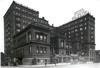
Majestic Hotel

Past the theaters and clubs, at the gateway to North Broad's indulgent residential end, was the Majestic Hotel at Broad and Girard. A grand hotel which conjures up images of a new era of wealth and society brought about by the early 1900s and immortaliozed by Hollywood, the Majestic was another jewel unceremoniously demolished in 1971. Even in it's dilapidated state in the 1960s one can't help but wonder why on earth this wouldn't have been saved. It was designed by Stanford B. Lewis. Currently a suburban style McDonalds sits on the site with it's own surface parking.

Odd Fellow's Temple

Arguably one of the biggest losses of the Convention Center expansion was the Odd Fellows' Temple, or Sweeten Auto Company building on North Broad Street. During the site preparation for the expansion, there was much debate over the Race Street Fire House and the illegally demolished Philadelphia Life Insurance Company buildings on North Broad, but very little mention was made of the most massive loss. The Odd Fellows' Temple design was submitted in 1892 by Hazlehurst & Huckel and built in 1893. As originally built, the Odd Fellow's Temple contained smaller windows than the North Broad building we all came to know which was demolished in 2008.

Scottish Rite "Town Hall"

1966
Another North Broad treasure lost to the parking craze of the 1980's was the Scottish Rite Temple or Town Hall at Broad and Race, built in 1926 and designed by Horace W. Castor. The bizarre, stone walls of the secret society unceremoniously met the wrecking ball in 1983 to make way for Parkway Corporation's poorly designed garage and headquarters.

During demolition in 1983

Broadwood Hotel

At one time, and now again, South Broad Street is spotted with the grand homes to Philadelphia's performing arts community. However North Broad Street was at once the post industrial home to the new, 20th century art world and briefly experienced the decadence afforded by the Industrial Revolution with massive entertainment venues never attempted in the historically stuffy and bourgeois theaters on and surrounding South Broad Street.

One of the most monolithic - and recent - architectural losses of North Broad Street's Golden Age was the Broadwood Hotel which also served as the Elk's Lodge and Philadelphia Athletic Club. Completed in 1924 by Ballinger Company and Andrew J. Samuel, it housed a ballroom that hosted the Eugene Ormandy Orchestra and saw many outstanding and historically relevant performances through its life. It was placed on the National Register of Historic Places in 1984 yet like many other gems of North Broad Street met the wrecking ball a short time later. Like many victims of Philadelphia's "renaissance", it is now the site of an uninspired parking garage - next and adjacent to three other large surface parking lots - operated by the parasitic Parkway Corporation.
It's history is hazy, it's loss all but forgotten, along with countless other North Broad Street masterpieces.

Thursday, October 15, 2009

The Vine Street Expressway Problem

One of our largest lesions of surface parking lots sits in a forgotten corner of Center City. Parking Lot Town is boxed in by the Convention Center, the Vine Street Expressway, and a vibrant Chinatown brimming with authenticity rare to most American Chinatowns - a Chinatown consistently targeted by city officials and predatory developers, loved by locals and long time residents, and abhorred by urban newbies and Yellow Tags. Asian owned businesses continue to thrive not just along Arch and Race, but also north of Vine along Callowhill. Philadelphia's Chinatown may be one of the few which continues to grow as a traditional immigrant neighborhood while relatively untouched by development geared toward gentrification or an attempt to attract a homogenized upper-middle class market, all in spite of the casm the Vine Street Expressway cuts through this neighborhood, and the parking holes that litter it's perimeter.

Much has been said regarding the Vine Street Expressway. As one of the nation's shortest interstate highways, many simply question the need for it at all. Prior to its construction which took the better half of a century, Vine Street was a significantly large avenue. Though it carried drivers across the city much slower than the VSE, considering the width of Center City, is it absolutely necessary to carry them across it at 55 miles per hour, particularly since most will be traveling it during rush hour traffic?

But whether you like it or not, it's here to stay. The question is how does it remain, and what responsibility do we have to the surrounding communities it divided? Boston's "Big Dig" often comes up as a solution. Boston's I-95 cut through the literal core of the city and spanned a much larger distance and was ripe with problems. Philadelphia's VSE is much shorter, straighter, and not surrounded by the kind of large scale, modern development that lines Boston's I-95 so capping it between 10th and Broad would be relatively simple. Relatively.

Unfortunately capping it might only produce more parking. Look at the area that caps the regional rail lines leading from Market East Station. One thing Philadelphia doesn't seem to undertsand is that it's pointless (unless you want more parking) to cap something if you never plan on building anything above it. If we capped the VSE it could be nothing but parking lots. Philadelphia seems obsessed with parking. Too much is never, ever enough. We're one of the densest city's in the US, and in most neighborhoods where the average home is about as wide as a midsized sedan, residents feel entitled to at least two cars. While people in Los Angeles work towards creating public trasit options and reducing the need for cars, Philadelphia wants more parking. I'll save that for another time.

As for the VSE, why not look at it this way? Why was it built as a recessed freeway in the first place? There's really no reason. Recessed it is less obtrusive and less visible. Why not cover the VSE with Vine Street, probably what should have been done in the first place. Move the south side of the actual street on top of the VSE, reunite it with it's northern brother, open up the sea of parking lots that the south side demolition created, and give developers a wider plain to work with between Vine and Summer. This increases the room for parking garages to service Conventioneers and hotel guests, making the remaining surface lots unfriendly, ugly, and unecessary. With the VSE underground you unite the Loft District with Chinatown, remove the eyesore of a freeway in your backyard and give investors incentive to create a whole new neighborhood.

Philadelphia Story

La Ronda has been torn down but what about Ardrossan - inspiration for the 1940 classic Philadelphia Story starring Katharine Hepburn and James Stewart? Nothing more than speculation has been discussed since it went on the market. The Villanova mansion was designed by the famed Horace Trumbauer, but regardless of its history it seems to get less attention than some of his less influential and reverred homes.

Friday, October 9, 2009

Dilworth Plaza

Is the Dilworth Plaza redesign really that great, or does it look so good because it's clean? Renderings often conceal bad design, especially when you take a desolate, dirty public space and airbrush in pedestrians, trees, and shiny new pavement. If two designs were given to someone unfamiliar with Dilworth Plaza, would a rendering of a new Dilworth Plaza look any more impressive than a rendering of a cleaned and bustling Dilworth Plaza as it exists today? Probably not. But Dilworth Plaza doesn't lack design and good design isn't going to save it. What a new design will do - good or bad - is remind us all that Dilworth Plaza is here.

No matter what plan is put forth, naysayers will always argue any public space will become a concrete landfill collecting trash from commuters and a gathering place for homeless and pigeons. It took half a century to make the more seasoned Philadelphians realize that Independence Mall wasn't our Hooverville. And plenty who still use that term refuse to accept it as the successful public space it has become.

But Dilworth Plaza isn't about them, it doesn't have to be about them, and in a fitting honor commemorating its namesake, Richardson Dilworth wouldn't have want it to be about them. Dilworth Plaza is about the new life surrounding City Hall. Once closed at five on Friday, overlooked by a macabre and charred One Meridian Place, this forgotten gem in the shadow of one of the most impressive and architecturally revered buildings in the world has the potential to attract those who have made Center City Philadelphia what it has become in the past two decades.

Overlooked by the new Residences at the Ritz, surrounded by a growing number of hotels, adjacent to the new entrance of the Convention Center, Dilworth Plaza's reinvention isn't about architecture and design, it's about attracting activity to the literal heart of our city.

The unintrusive glass entrances, similar to the entrance across the street and the east entrance to Suburban Station - both underrated and undercelebrated improvements to the overall City Hall/Suburban Station transportation complex - don't overwhelm this natural space. In the overall design we see a lot of the same concrete but we also see a lot of grass. Given the advantages growing around it, this square has the potential to become a twilight enclave of Bohemia much like Rittenhouse and Washington Squares. Add to it a large shallow pool outfitted for fountains and easily transformed into an ice skating rink, it draws even more activity by attracting families, friends, and couples seeking unique evening or weekend afternoon activities that don't require a car.

As it exists, Dilworth Plaza doesn't need a lot of work. What it needs is a simple facelift - seen here - a good scrubdown with Lysol, and more than anything a reminder to all of us that it is here and that is exactly what this plan does.


Philadelphia Intermodal Transportation Center

Just kidding. But how cool would that be?

In 2008, Pittsburgh's Port Authority of Allegheny County (PAT) opened the Pittsburgh Intermodal Transportation Center. PAT serves bus routes, the Monongahela Incline funicular railway, and the light rail or subway lines. The Pittsburgh Intermodal Transportation Center at Grant Street houses the Greyhound terminal and 991 parking spaces in this new complex in downtown
Pittsburgh.

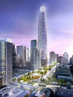
San Francisco has been trying to organize something similar - albeit more ambitious - in an attempt to organize its downtown transportation systems in the form of the Transbay Terminal with a tower designed by Cira Centre's Cesar Pelli.

And even car-crazy Anaheim County in Southern California is ambitiously launching the Anaheim Regional Transportation Intermodal Center (ARTIC), designed by HOK Los Angeles and Parsons Brinkerhoff, to serve as the hub for commuter rails and two new high speed lines.

Philadelphia has the perfect location to unify our transportation facilities almost completely built for us in the form of Market East Station and the Gallery at Market East. The Gallery - which I previously professed is not as ugly (or as useless) as everyone claims it to be - could easily serve as our intermodal transportation center. Sitting atop a regional rail hub and subway stop, near the Market Street trolley, and with a Patco station at 8th and Market, all directly next to the Greyhound terminal. These facilities could be streamlined into one, relocating SEPTA's headquarters to the Strawbridges building offering officials an eagle's eye view into their product, and seamlessly merging the Greyhound and Patco facilities thus offering riders easy and clean access to various modes of public transportation.

Add to these facilities a clean and revitalized Market East, we may someday see a tourist trolley taking riders through Old City towards a newly planned historic waterfront where the could catch a Delaware Avenue light rail to one of the casinos.

One can dream, can't he?

Thursday, October 8, 2009

New York Takes On Barnes

Jumping on the Robert Venturi bandwagon, a hack of a different sort has come out against the relocated Barnes Museum. This time in the form of the condescendingly elitist New York Times' architecture critic Nicolai Ouroussoff. Say what you will about Inga Saffron (Philadelphia Inquirer Architecture Critic and Pulitzer Prize Nominee), but she will tell you what she likes and why and spends the bulk of her articles discussing aesthetics rather than dwelling in the politics of "art". She engages all of her readers, allowing them to understand design instead of pretentiously trying to make those outside the art circle feel like slack jawed troglodytes for disagreeing. She's real.

Ouroussoff not only dislikes the design, he dislikes that the collection is being reloacated from Lower Merion. Apparently such a collection serves our culture better when limited to a knowledgeable art community rather than available to the urban public and tour busses. Aside from which he's clearly done no research into the reasons behind the move, and the problems between the current museum and the county. He's also done no research into the philosophy behind the design of the building in the grounds, meant to replicate the entire experience in the original location, a replication mandated as a requirement with the move.

This article reeks of jealousy more than anything.

http://www.nytimes.com/2009/10/07/arts/design/07barnes.html?_r=2&hpw

Wednesday, October 7, 2009

Project H.O.M.E. and Bethesda Project

Project H.O.M.E. in coordination with the Bethesda Project have broken ground on an LEED-Certified, housing project in Center City, just a block from City Hall. That's prime real estate, just behind the SEPTA building and St. John the Evangelist Church on 13th Street.

Designed to house 79 residents, the building occasionally conjures up images of mid-century public housing or a school, but it does so in kind of a cool way. With it's narrow windows and discrete entrance, at first glance I thought it was a really hip rehab of an outdated building that currently occupied the lot. But the more I look at it, the more I like it. And it's green!

Good job guys!

The Gallery at Market East: Is it Really That Bad?

A lot has been said about The Gallery at Market East, and very little of it good. And as one who has used many choice words to descibe the mall, I somehow find myself there at least once a week. Why? Because it's convenient. Sure, it's packed with obnoxious teenagers, but what mall in America isn't?

Is The Gallery at Market East really that bad? Let's put aside what architecture was lost to build the mall and take a look at what we are left with. It's not an eyesore, or doesn't have to be. Sure, it's not great architecture, but most malls aren't. Regardless of their brutal and cold exterior, many malls - even ones located in urban cores - continue to thrive
.

The American Mall is a case study in Marketing 101. No matter where they are or
what they look like they make you want to come inside and spend money. And aside from The Gallery, they make this marketability look so easy. How is it that while other malls - clad in the same windowless concrete - look so inviting, while The Gallery looks more like a Soviet fortress than the symbol of capitalism it should be?

Inside and out The Gallery is clean and practical. Aesthetically it is in need of a very simple makeover. Lighting fixtures and a new font would go a long way toward not only attracting clientele, but also attracting businesses that recognize an organization eager to create a new image. Take a look at Washington's urban mall, Mazza Gallerie. Architecturally, short of a face lift, isn't much different than The Gallery at Market East.

It's in a more subdued neighborhood, true, but doesn't have nearly the number of perks that should theoretically give The Gallery at Market East every conceivable leg up. Our urban mall is a few blocks from some of the most historic grounds in the country, a few blocks from the hotel hub, and a few blocks from some of the most expensive property in the city. And possibly the greatest advantage, it sits on top of the Market East Regional Rail Terminal, SEPTA's subway and trolley lines, and the Patco High Speed Line.

The Gallery has no excuse for a lack of appeal. The only excuse it
can possibly offer is mismanagement caused by laziness.

Pioneer Place in downtown Portland, OR is located at the core of the city and continues to thrive. Note the use of glass on the exterior, while it looks in on mostly display windows it offers a much more inviting appearance, a very simple adaptation that could be applied to all of The Gallery's facades.

Robert Venturi on Barnes

Robert Venturi - one of a handful of late 20th century architectural hacks including Graves and Gehry - has thrown himself in as the latest thorn in the ass of moving the Barnes Museum to the Parkway. Is it just bad timing that he waited for the release of the rendering to express his grievance over the museum's move from Lower Marion or is something else going on. Where was he for the past five years? Could his pride be just a little hurt at the release of Tod Williams and Billie Tsien's graceful design for the new Barnes Museum on the Parkway?

I will admit, in the face of a recession, library closings, and a potential arts and culture tax, $200M does seem a bit excessive. And from the looks of the building, I can't see where the bulk of the expense lies. On the other hand some of our greatest cultural and architectural gifts are granted by public funds during economic down times.


http://latimesblogs.latimes.com/culturemonster/2009/10/architect-robert-venturi-slams-proposed-barnes-foundation-move.html

Monday, October 5, 2009

Barnes Foundation

A rendering for the long awaited move of the Barnes Foundation to the Parkway will be released this Wednesday. The design of the current gallery is to be replicated in the new structure, and although it's being held confidential, the building will also contain a cafe, bookstore, and auditorium. I'm curious what's going to happen with the original building?

Thursday, October 1, 2009

La Ronda Demolished

I hope Kestenbaum's salvage rights were worth the grief this souless little man will receive from not just his neighbors, but an entire metropolitan community that understands the importance of our historic and architectural heritage. It's going to be cold and lonely in that McMansion of his for a long, long time.