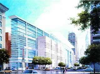
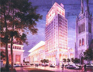
 What I've noticed lately when passing the construction site is that all of the renderings seem to exaggerate the width of Broad Street. They also seem to somehow underscore how tall the building actually is. In other words, this is a massive building on a relatively narrow street. I have no problem with density but this isn't a series of structures making up a block, they tore those down. The is one structure a full block long. I think that one of the other two designs would be more appropriate for the relationship between the structure and the sidewalk. The horizontal lines on the above rendering will carry the eye across and already long structure and cause a dizzying effect from the sidewalk in relation to the height. The more compartmentalized designs below as well as the lighter shade of the finish would be more appropriate for a relatively narrow street scape.
 Unfortunately very few renderings were ever offered of this project. The only other perspective seemed to highlight the existing high rise and demolished facades more than the actual bulk of the construction. It will be interesting to see how this stadium-size building will play out two blocks from City Hall. One thing we certainly need to watch out for is the inevitable reclamation of surrounding property for more surface lots.
No comments:
Post a Comment